
This is Part 2 in a series of posts designed to get you from Zero to Mobile Hero. In the first post, we discussed setting up our iOS and Android applications and linking them to our Ruby on Rails web app. In this post, we will add native components to enhance the look and feel of our native mobile applications using Hotwire’s BridgeComponent.
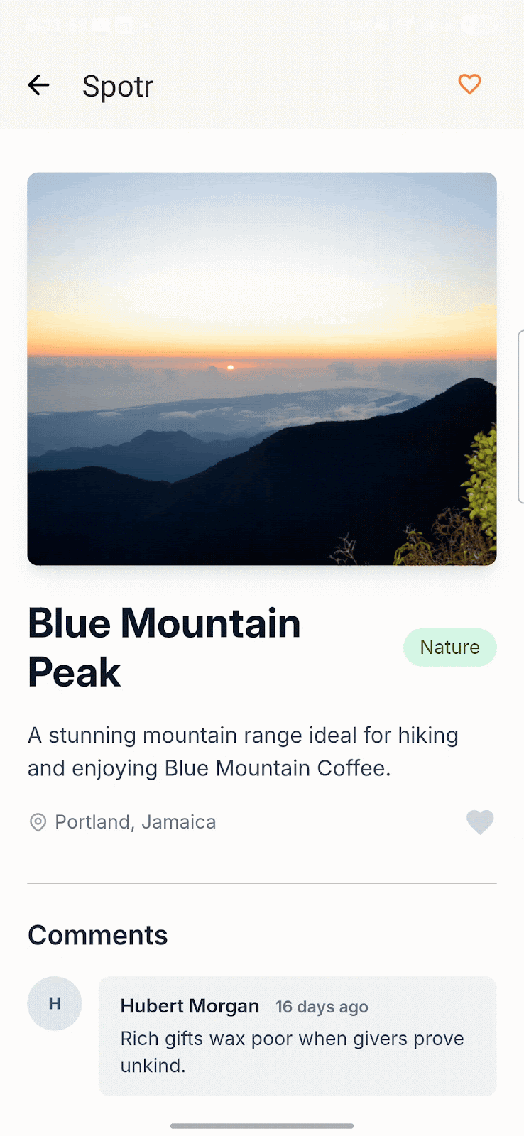
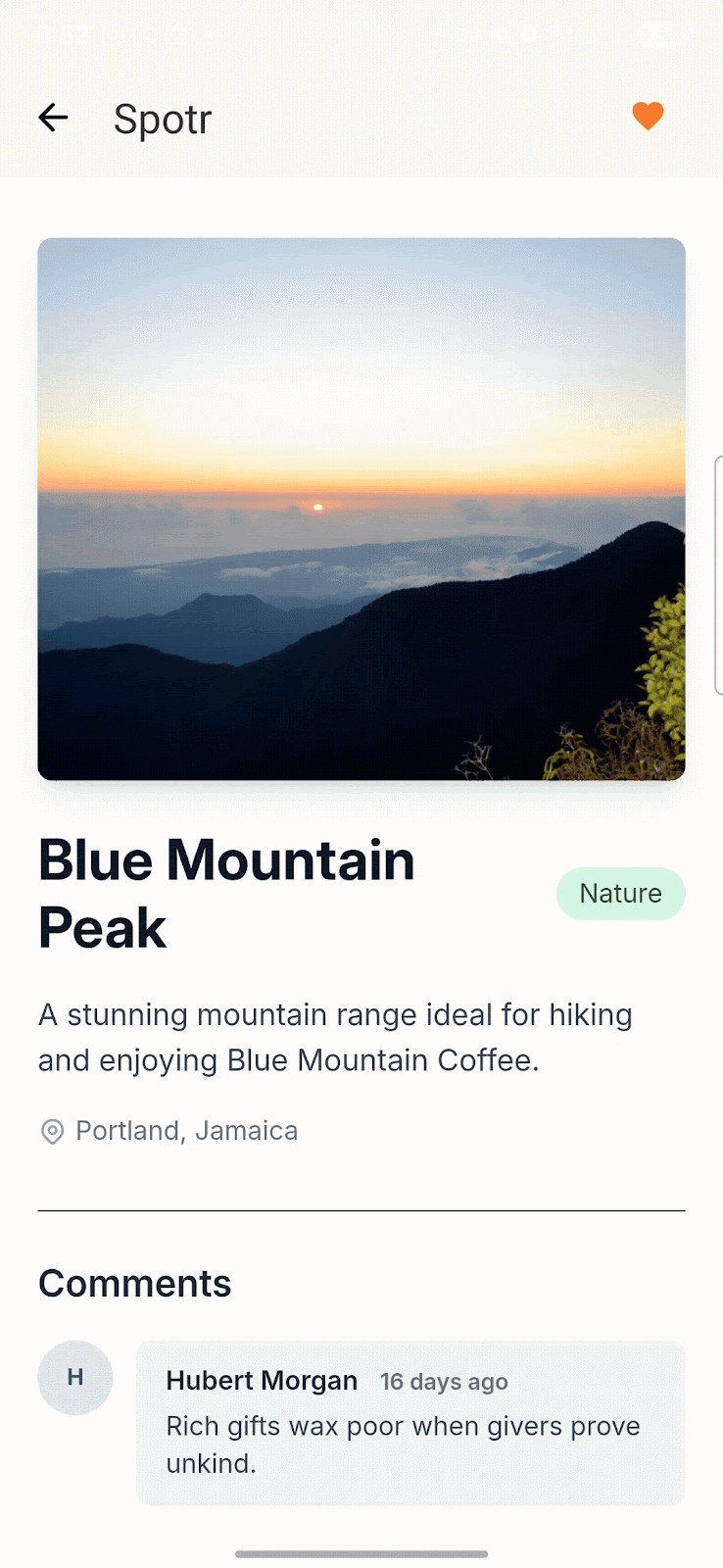
The bridge component is the star of the show for Hotwire Native. It uses data attributes on HTML elements and snippets of JavaScript to create native components that enhance the look and feel of your apps. Under the hood, Hotwire Native uses JavaScript to send data to and from the native application. If you’re already using Stimulus, you will feel very comfortable in creating Bridge Components because the APIs are very similar. For our first bridge component, let’s convert our “heart” button to a native button. On our show page, we have a button that allows a user to add a spot to their favorites. On mobile, users are accustomed to having this button in the navigation bar.
To get started, we need to add the hotwire-native-bridge package to your application. If you’re all no-build like me, you can use importmap /bin/importmap pin @hotwired/stimulus @hotwired/hotwire-native-bridge. Otherwise, you can enter yarn add @hotwired/hotwire-native-bridge to add the package to your package.json file. Please note that Stimulus is a requirement. Next, create a JavaScript file at app/javascript/bridge/heart_controller.js. Again, this file naming scheme should be familiar to Stimulus users.
import { BridgeComponent, BridgeElement } from "@hotwired/hotwire-native-bridge"

export default class extends BridgeComponent {
  static component = "heart"

  connect() {
    super.connect()
    this.notifyBridgeOfConnect()
  }

  notifyBridgeOfConnect() {
    const bridgeElement = new BridgeElement(this.element)
    const checked = bridgeElement.bridgeAttribute("checked") == "true"

    this.send("connect", { checked }, () => {
      this.element.click()
    })
  }
}
The above class defines the component as a static string. This string is used on the native side to identify the component. In the HTML file we define the controller by setting the data attribute "controller" to "bridge" followed by two hyphens ("-") then the name of the component. e.g. data-controller=”bridge–heart”. We will need to track the button state and we can do this using the same data attributes. We set the bridge element checked value by setting data-bridge-checked. Similarly, we can use the prefix data-bridge to set other variables and retrieve them via bridgeElement.bridgeAttribute("name-of-attribute").
<%# locals: (spot:, css_class: nil, mobile_component: false) %>
<% if spot.favorited_by?(current_user) %>
 <%= link_to spot_favorite_path(spot, current_user.favorite_for(spot)), class: "#{css_class} text-red-500 hover:text-gray-300 cursor-pointer btn-heart",
   method: :delete, data:{ turbo_method: :delete, controller: mobile_component ? "bridge--heart" : nil, bridge_checked: false } do %>
   <%= inline_svg_tag("unlike.svg") %>
 <% end %>
<% else %>
 <%= link_to spot_favorites_path(spot), class: "#{css_class} text-gray-300 hover:text-red-500 cursor-pointer btn-heart",
             method: :post, data: { turbo_method: :post, controller: mobile_component ? "bridge--heart" : nil, bridge_checked: false } do %>
   <%= inline_svg_tag("like.svg") %>
 <% end %>
<% end %>
The Android Bridge
Back in Android Studio, we need to add the corresponding HeartComponent. We can create a new package under our main directory called bridge. Then create the HeartComponent file.
class HeartComponent(
   name: String,
   private val delegate: BridgeDelegate<HotwireDestination>
) : BridgeComponent<HotwireDestination>(name, delegate) {

   private val actionButtonItemId = 15
   private var actionButtonMenuItem: MenuItem? = null
   private val fragment: Fragment
       get() = delegate.destination.fragment
   private val toolbar: Toolbar?
       get() = fragment.view?.findViewById(dev.hotwire.navigation.R.id.toolbar)

   override fun onReceive(message: Message) {
       // Handle incoming messages based on the message `event`.
       when (message.event) {
           "connect" -> handleConnectEvent(message)
           else -> Log.w("HeartComponent", "Unknown event for message: $message")
       }
   }

   private fun handleConnectEvent(message: Message) {
       val data = message.data<MessageData>() ?: return

       val menu = toolbar?.menu ?: return
       val inflater = LayoutInflater.from(fragment.requireContext())
       val binding = HeartComponentBinding.inflate(inflater)
       val order = 999 // Show as the right-most button
       val text = if (data.checked) "Remove Heart" else "Heart"

       binding.button.apply {
           isActivated = data.checked
           setOnClickListener {
               performSubmit()
           }
       }

       menu.removeItem(actionButtonItemId)
       actionButtonMenuItem = menu.add(Menu.NONE, actionButtonItemId, order, text).apply {
           actionView = binding.root
           setShowAsAction(MenuItem.SHOW_AS_ACTION_ALWAYS)
       }
   }

   private fun performSubmit(): Boolean {
       return replyTo("connect")
   }

   // Use kotlinx.serialization annotations to define a serializable
   // data class that represents the incoming message.data json.
   @Serializable
   data class MessageData(
       val checked: Boolean
   )
}
Our HeartComponent finds the Toolbar and adds the heart as the last icon to the right. When pressed the button sends a reply to the WebView which results in the button being clicked. If you’re paying attention, you’ll notice that we’re creating a binding with HeartComponentBinding which requires a heart_component.xml file in the res/layouts directory.
<?xml version="1.0" encoding="utf-8"?>
<FrameLayout xmlns:android="http://schemas.android.com/apk/res/android"
    android:layout_width="wrap_content"
    android:layout_height="match_parent"
    xmlns:app="http://schemas.android.com/apk/res-auto"
    android:layout_gravity="end|center_vertical"
    android:paddingEnd="16dp">

    <com.google.android.material.button.MaterialButton
        style="@style/Widget.Material3.Button.IconButton"
        android:background="?selectableItemBackgroundBorderless"
        android:id="@+id/button"
        android:layout_width="wrap_content"
        android:layout_height="48dp"
        app:icon="@drawable/ic_heart" />
</FrameLayout>
You’ll need to add a ic_heart.xml file to your drawables folder. The ones used in this example are from Google Fonts. To finalize our setup we need to add our component to the Hotwire Native configuration, and we do that by updating our Application class.
class SpotrApp: Application() {
    ..
    private fun configureApp() {
        ..
        Hotwire.registerBridgeComponents(
             BridgeComponentFactory("heart", ::HeartComponent)
        )
    }
}
Pat yourself on the shoulders, you’re a real Android Developer now! We can see our native button in our app and if you look closely you can still see the web button changing as the toolbar icon is pressed. We clean that up with a little css.
By default when your Hotwire Native application launches, a data-bridge-platform attribute is added to the HTML tag in this case it would be set to android. Also added is a data-bridge-components attribute which is a comma delimited list that contains all the components loaded by the Hotwire Native. We can use this information to remove the duplicate heart from our app.
[data-bridge-platform] {
  .btn-heart {
    display: none;
  }
}
The iOS Bridge
Now that we have our Android component out of the way, we can update our iOS app to use our bridge component. First, we need to create our HeartComponent file. I usually like to create a folder called Bridge then add my components there (Bridge/HeartComponent.swift).
import HotwireNative
import SwiftUI

public class HeartComponent: BridgeComponent {
    public override class var name: String { "heart" }

    public override func onReceive(message: Message) {
        guard let viewController else { return }
        addButton(via: message, to: viewController)
    }

    private var viewController: UIViewController? {
        delegate?.destination as? UIViewController
    }

    private func addButton(via message: Message, to viewController: UIViewController) {
        guard let data: MessageData = message.data() else { return }

        let action = UIAction { [unowned self] _ in
            self.reply(to: "connect")
        }

        let image = UIImage(systemName: data.checked ? "heart.fill" : "heart")
        let item = UIBarButtonItem(image: image, primaryAction: action)
        viewController.navigationItem.rightBarButtonItem = item
    }
}

private extension HeartComponent {
    struct MessageData: Decodable {
        let checked: Bool
    }
}
This adds the heart button to the right of the navigation bar. Rather than using Google Fonts for this iOS “heart” icon, we’re using SF Symbols which is Apple’s Native icon library for iOS and macOS and comes with Xcode. When pressed, it sends a reply to the WebView which results in the button being clicked.
Pro-tip: If you are running the app in a Simulator, you can open up Safari and go to Develop -> [Simulator] -> [App] to inspect the app's webview as you would in a browser.
Next, we need to add our component to the HotwireNative configuration. We do that by updating our AppDelegate file.
import HotwireNative

@main
class AppDelegate: UIResponder, UIApplicationDelegate {
    func application(_ application: UIApplication, didFinishLaunchingWithOptions launchOptions: [UIApplication.LaunchOptionsKey: Any]?) -> Bool {
        configureHotwire()
        return true
    }

    private func configureHotwire() {
        let localPathConfigURL = Bundle.main.url(forResource: "path-configuration", withExtension: "json")!
        let remotePathConfigURL = Spotr.current.appendingPathComponent("api/v1/configurations/ios.json")

        Hotwire.loadPathConfiguration(from: [
            .file(localPathConfigURL),
            .server(remotePathConfigURL)
        ])

        HotwireNative.registerBridgeComponents([
          HeartComponent.self
        ])

        // Set configuration options
        Hotwire.config.backButtonDisplayMode = .minimal
        Hotwire.config.showDoneButtonOnModals = true
#if DEBUG
        Hotwire.config.debugLoggingEnabled = true
#endif
    }
}
In our AppDelegate we register our HeartComponent with HotwireNative bridge components. We're also setting some configuration options for our app. The backButtonDisplayMode is set to .minimal which hides the back button text and only shows the back arrow. The showDoneButtonOnModals is set to true which shows a "Done" button on modals. Finally, we set debugLoggingEnabled to true which logs debug information to the console. You can remove this line when you're ready to ship your app.
Awesome! Now we have a native heart button on both Android and iOS. By now you should be able to see how easy it is to create BridgeComponents and should be thinking of all the other places you can use this in your app. In my own apps, I've used them to store push notification tokens, handle sharing, and even for authentication. I'll leave those as an exercise for you to explore. You can also try changing the primary color from the default blue to another color. In the next post, we'll take a look at how we can implement a native authentication flow with Hotwire Native. Until then, happy coding!

Dane Wilson is a Senior Software Engineer at The Gnar Company, where he builds scalable, production-ready applications for a wide variety of clients. Since joining The Gnar, he's developed AED equipment management systems for a major emergency response company and built reverse logistics infrastructure for Onepak's e-waste recycling platform.
With over a decade of full-stack experience, Dane has a track record of modernizing legacy codebases and establishing engineering best practices at companies including Teladoc, Primary.Health, and Kinship. He's passionate about clean architecture, mentoring junior developers, and writing code that future engineers will actually thank you for.
When he's not refactoring legacy code or conducting code reviews, you'll find him watching Manchester United and being a proud girl dad.