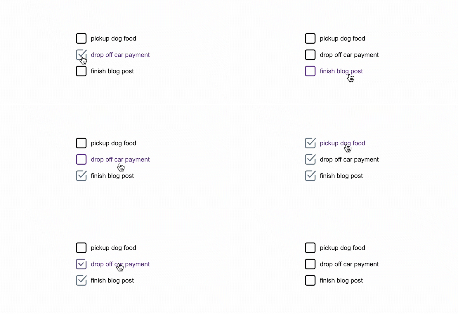
SVGs (scalable vector graphics) may be old news, but we use them in modern development stacks all of the time. Our device displays have increasingly more pixels, and SVGs can scale infinitely while staying crisp and clean. Similar to HTML, the SVG standard is based on XML and provides a way to describe shapes and paths with markup.
While there are plenty of ways to use an SVG, we’ll focus on how to use them in small ways to enhance a user's experience. We can provide feedback to users as they interact with our applications by updating the state of SVG attributes, and by using CSS to transition these changes.
How to Import an SVG in React
When it's time to use an SVG in a React project, I always find myself searching for how to import the SVG file into my React context. There is more than one way to do this, and I always need the reminder.
Create React App
Create React App (CRA) currently ships with an SVG logo. It’s imported and used as the src value for an image element.
import logo from './logo.svg';

...

<img src={logo} className="App-logo" alt="logo" />
There is another way to import an SVG in Create React App, though. We can import the SVG as a ReactComponent. This is because CRA leverages SVGR to process SVGs.
import { ReactComponent as ReactLogo } from './logo.svg';

...

<ReactLogo className='App-logo' alt='logo' />
Using the SVG in this way, we can leverage SVGAttributes, and className as props.
Vanilla React
Outside of Create React App, we have a few options when importing our SVG. We can use SVGR to generate a Component or add SVGR to our webpack configuration so that we can import SVGs in a similar way as the above CRA example. Alternatively, we can create a simple component that returns our SVG.
An SVG as a Component becomes a handy tool that can be tied to our application state just like anything else.
Example: Animating an SVG
When building an interface, we often want to give the user feedback when they perform an action, and we can use an SVG to enhance this process.
In this example, we will create an SVG that represents the checked and unchecked states of a check box icon and use CSS to transition between them. There are many SVG resources available for free, but it often makes sense to roll our own. We used Adobe Illustrator to create an SVG with two simple shapes.


We intentionally broke our checkbox path to have an end and a beginning. This is helpful because it allows us to easily animate from and to a particular location.
An SVG may often contain extra information we don’t need, so it's good to see if it can be simplified before using it. After we have our SVG file, we can use something like SVGOMG to optimize and clean up our SVGs.
Now that we have a trimmed-down file, we can describe it with classes and other accessible information. We're using color="currentColor" which lets the SVG inherit the color of its parent element.
<svg xmlns="http://www.w3.org/2000/svg" width="24" height="24" class="Checkbox">
  <path class="Checkbox-Box" fill="none" stroke="currentColor" stroke-linecap="round" stroke-linejoin="round" d="M19.01 2C20.66 2 22 3.34 22 5v14.01c0 1.65-1.34 2.99-2.99 2.99H5a3 3 0 0 1-3-2.99V5c0-1.65 1.34-3 3-3h13.76" />
  <path class="Checkbox-Checkmark" fill="none" stroke="currentColor" stroke-linecap="round" stroke-linejoin="round" d="M7 10.55 11.09 15 22.5 2.5" />
</svg>
We can use CSS to describe how we want the checkbox to behave in “checked” and “unchecked” states. We’ll rely heavily on stroke-dasharray and stroke-dashoffset. Let’s start by setting up the elements to look “unchecked” by default.
The stroke-dasharray property instructs the stroke to be dashed instead of solid, and sets how long the dashes and gaps should be. We’re setting the .Checkbox-Box to have dashes that are long enough to make the box look whole.
For the .Checkbox-Checkmark, we make the stroke-dasharray long enough to account for the shape, and then use stroke-dashoffset to move the dashed stroke along the path to reveal the empty space in between the dashes instead of a dash mark. This makes the checkmark look absent and prepares it to be revealed.
.Checkbox {
  stroke-width: 2px;

  &-Box {
    stroke-dasharray: 86;
    stroke-dashoffset: 0;
    transition:
      color 0.12s ease-out,
      stroke-dasharray 0.12s ease-out,
      stroke-dashoffset 0.12s ease-out;
  }

  &-Checkmark {
    stroke-dasharray: 23;
    stroke-dashoffset: 23;
    transition:
      color 0.12s ease-out,
      stroke-dashoffset 0.12s ease-out;
  }
}
Now, let’s add styles for the “checked” state. When the Checkbox__checked class is present, we change the stroke-dasharray and stroke-dashoffset values for our paths.
The .Checkbox-Box gets a smaller stroke-dasharray and a negative stroke-dashoffset value. This gives the appearance of the top-right corner opening up. The .Checkbox-Checkmark gets a stroke-dashoffset of 0, which will give the appearance of it being drawn.
.Checkbox {
  …

  &__checked {
    .Checkbox-Box {
      stroke-dasharray: 60;
      stroke-dashoffset: -11;
    }

    .Checkbox-Checkmark {
      stroke-dashoffset: 0;
    }
  }
}
These attributes could be set on the SVG elements themselves, but we can add a transition to those values if we bring them into CSS. Check out the finished result:
This approach can accomplish a lot with a small amount of code, but it’s especially effective for small visual changes and user feedback. If we have a more complex visual requirement, we may consider reaching for Greensock, Lottie, or Barba instead.
There are endless possibilities here, so have fun bringing your own SVGs to life with React and CSS!
Learn more about how The Gnar builds React applications.
If you liked this article please subscribe to our newsletter
